How we redesigned our website
Over the last few years, the team has attempted to redesign the website for Content Design London (CDL).
Yet as people working at other agencies may understand, looking after our clients and their projects has often taken priority.
Here’s how we made the time and used our skills to completely transform our website for the better.
Challenges with the previous website
Our old website was a labour of love, thoughtfully designed by Sarah Winters and Mark Hurrell in 2016.
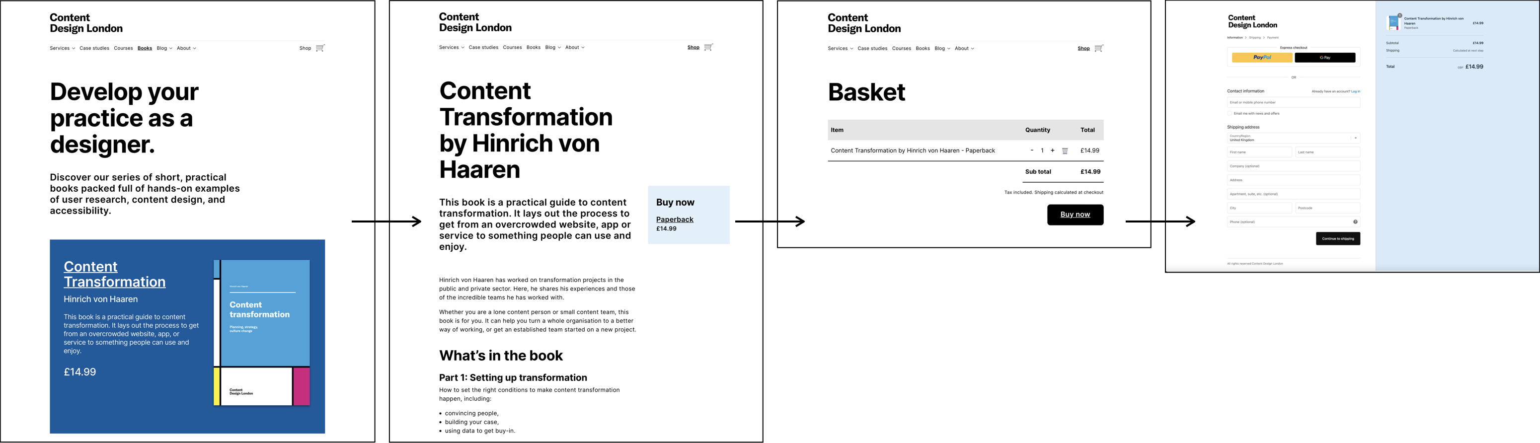
Yet as the team grew, so did our business and user needs. We knew that additional functionality would help everyone. For example, a shop to make it easier for people to buy our books and courses (and for us to sell them!).
As a small, remote team, we also needed a Content Management System (CMS) that was quick, simple and intuitive for everyone to use.
Partnering with Huxley Digital
After speaking with a few agencies, we decided to team up with Huxley Digital. They’re a web design agency based in Brighton. And, we found that they aligned with our values when it came to accessibility and inclusion.
We couldn’t have done this website without them. We’re content designers, not developers!
Making the time for the redesign
We decided to dedicate every Friday to Content Design London (CDL) work only. This meant that we could schedule the project alongside client work.
In quiet periods too, we prioritised this website over possible client work for some team members. Because in business, sometimes you have to make those decisions.
Research to better understand our audiences
Our first step was carrying out desk research to better understand:
- what search terms people used to find content services,
- how other agencies talked about similar services,
- how our existing website content performed against these.
We also mapped out our main audiences, bringing together the things we:
- already knew about them,
- assumed or did not know yet.
We considered our audiences’ needs against our business goals and existing website content. We also looked at any gaps in knowledge and opportunities.
The next step was creating a bank of user needs. We did this in a Google spreadsheet. These took the form of user stories and job stories. Every story we matched with ‘acceptance criteria’ - a list of things that the audience needs to complete the task. As part of this process we also mapped out journeys.
Example user story
As someone who wants to learn from experts,
I want to know what options you offer,
So I can choose the right one for me.
Example acceptance criteria
The user need is met when the user understands:
- who the course is for,
- what they'll learn,
- where the course will happen,
- how they can use it in their role,
- how it'll help with career development,
- if they can get a qualification,
- when is the next course,
- is there space on the course,
- how much it costs.
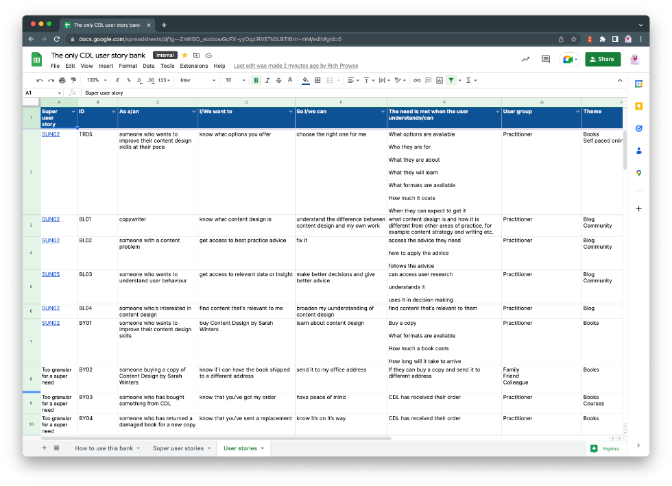 We also matched each user story with a section or page of our website.
Designing website components and content types
We then reviewed the existing website and services we used to sell book and courses to find common design patterns.
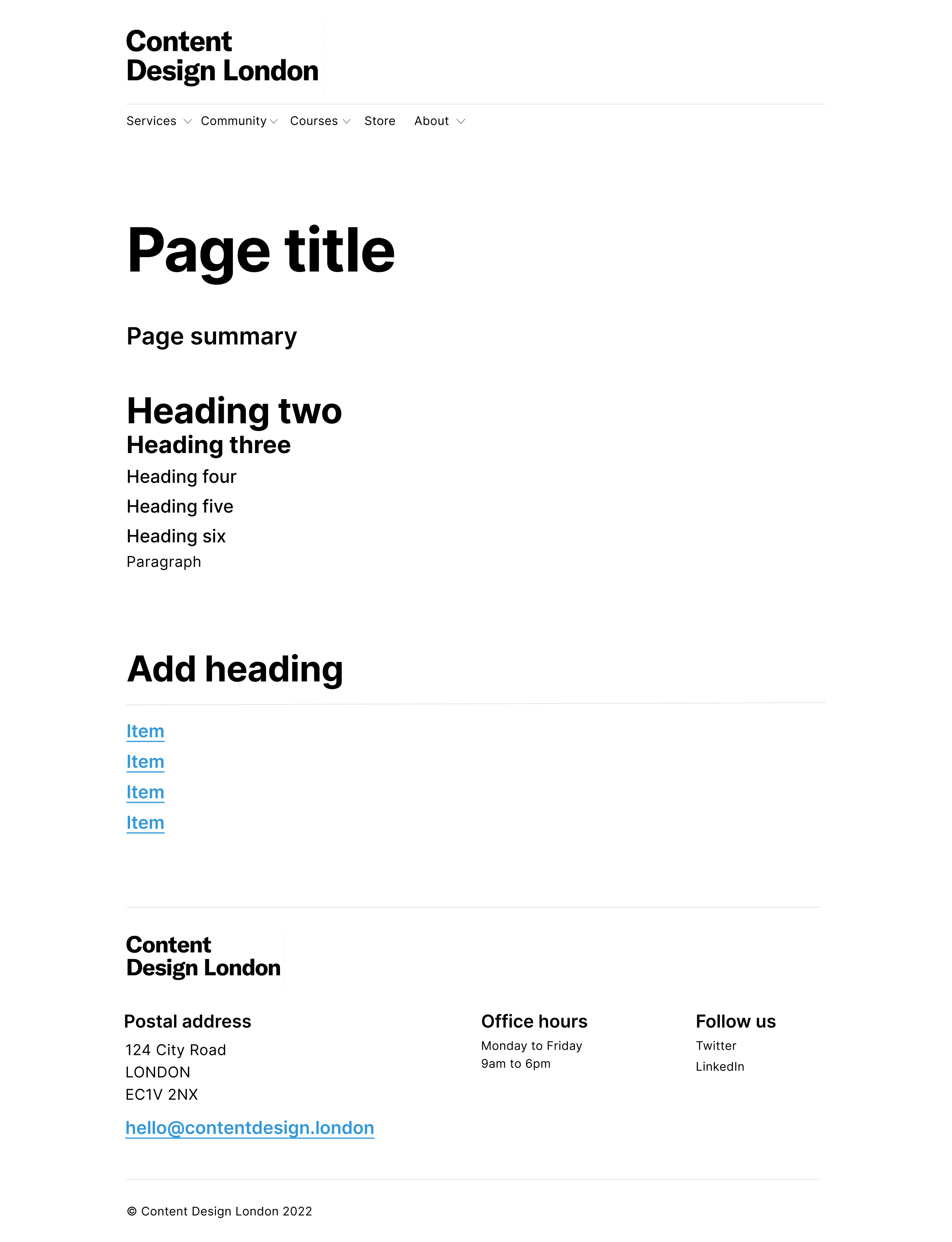
Design patterns are reoccurring ways of designing things in the User Interface (UI). We combined these patterns to create a series of content types including a:
- landing page,
- service page,
- blog post,
- product page.
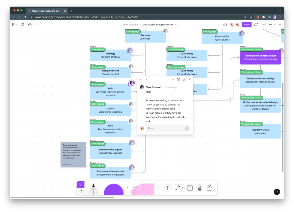
Each content type was sketched and added to Figma.
We used Figma's auto layout function to help create a prototype we could use to test with real content. This allowed us to test our assumptions and refine the design before we shared it with Huxley to develop.
 This process also allowed us to quickly visualise different user journeys and make sure that the design patterns and content types we'd designed would work together correctly.
 This helped to confirm our thinking on where we'd need to set up events and funnels in Google Analytics to help us better understand how people use the site.
![]()
Redesigning our website content
We reviewed our old website content to understand:
- the current user journey through the website,
- what information was clear, useful and relevant,
- if it was easy to know who the page was for,
- if users could make decisions based on the information.
Putting the most important message first
An example here was our consultancy page. The title “Speak your customers’ language” was unclear. It also started with a long introduction on the benefits of content design. By doing this, we had buried the main message.
For example, this content - “How good content helps you” - is quite long-form and would’ve been better suited to the blog:
"Some facts about content:
- 73% of people decide to buy something after reading the headline,
- more than 65% don’t reach the bottom half of your page,
- there are 13.9 million people living with a disability in the UK with a spending power of £249 billion a year.
Clear content that’s easy to understand shows that you care about your audience. You value their time. You talk to them in a language they understand. You don’t expect them to spend brain power on translating your messages into their words. You treat them with respect."
A new page style and structure
To focus on the benefits of our services, we restructured our pages so that they included a:
- bold, compelling title,
- clear introduction to the service,
- section about what our team does,
- final section about the benefits to our clients.
The new content we wrote was active and direct. We know our clients don’t have much time, so it was important for us not to waste it with long-form content.
All of this work was done by pair writing, which is our standard way of working. Quite frankly, we can’t imagine working alone now!
Testing the site with the Shaw Trust
The website has been tested for accessibility and meet WCAG 2.1 AA compliance. We've also asked the Shaw Trust to test our site.
The Shaw Trust is a social enterprise. It focuses on removing barriers in the workplace so that everyone has equal access to work opportunities.
Continuous improvement
The work doesn’t stop here! Continuing to monitor and update a site is an important part of a content designer’s work.
As part of writing the user needs and acceptance criteria, we’ve also agreed on metrics to measure the performance of pages. We'll use this data to continue to make improvements to the website, based on evidence and feedback.
We’ve set a schedule for regular maintenance and we’ll keep you posted on what we learn and change as we go.
For now though, we'll be having a little sit down with some well earned tea and biscuits. Ahhhh... ☕️ 🍪